Airsoft GI's Readying A New & Improved Online Store
OptimusPrime
19 Jul 2012
One of the things we ask from online airsoft retailers, apart from having fresh stock, provide generous warranties, customer support, and clear shipping and returns policy is having a website that's easy to use in terms of finding product information, purchasing options, and navigability. With more and more people doing their shopping online rather than visiting brick and mortar stores, having an online store is very much imperative. A business owner gets to have a 24/7 store without really being physically available 24/7 and the opportunity to cater to a wider customer base beyond the borders of a town, city, state, and country.
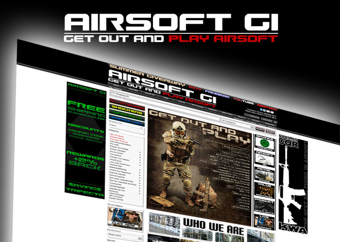
Airsoft GI is one of those airsoft retailers that have a serious online business, being selected by North American airsoft players as the Best Airsoft Retailer for North America at the Popular Airsoft Players' Choice Awards for two consecutive years. But the Airsoft GI folks are not resting on their laurels, having the full knowledge that having an online store is always work in progress, and have embarked on improving their online store to make it more responsive to their customers. Tim Seargeant, Airsoft GI's Marketing Manager, emailed us if we can take a look at their soon to be launched website, and find out if holds promise of providing fast product information, and a better online purchasing experience for their customers.
Tim enumerated some of the features of the new website which is still being refined and getting outside feedback from select individuals before making even more refinements before a re-launch:
- The search bar has been made much larger and is outlined in gray
- Categories drop down has been added to search bar.
- The Refine Search Column is completely new.
- Product picture layout has been changed.
- Added subsections to products to aid in searchable terms
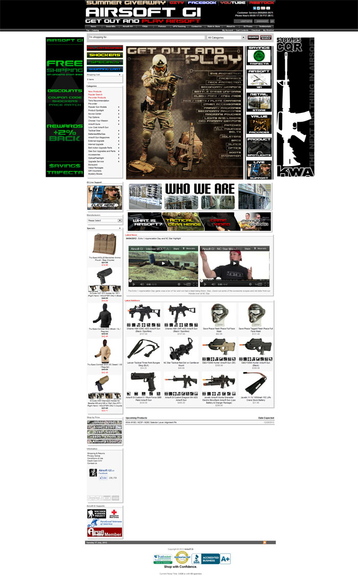
Now let's find out if these features are already available at their test site and if these hold promise for online customers. Before going in, here's a screenshotof the frontpage of the new design. Please take note that this may not exactly be the same when it gets launched:
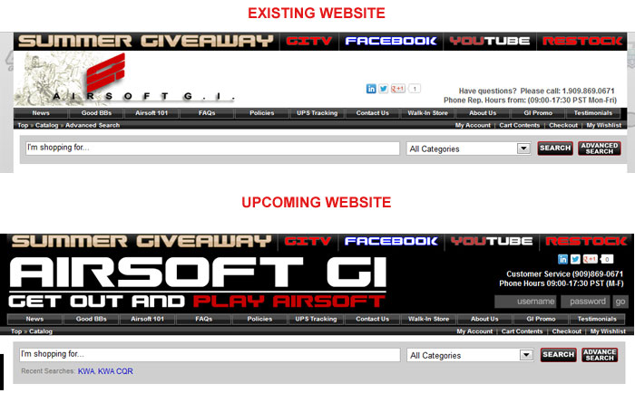
WEBSITE HEADER AND NAVIGATION
Opening the frontpage of the test site, the first impression is "what's new about the site?" It doesn't seem to look so much different from the existing website as most elements of the frontpage layout look the same, including navigation and search field.
But of course, first impressions are just that, first impressions, and I just take them at face value. The more important thing is to look closely to find the difference and it's obviously staring right in my face. The header of the new website is different from the old one, having a black background and a corporate logo that is all large text rather than a combination graphic and text and easily seen by the online visitor to immediately confirm that he/she has arrived at the right website.
The search form is easily noticeable this time, though the actual search form does not seem large than the existing one, but the gray background is indeed have been enlarged. I would rather have the background in black colour to make it even more noticeable, as gray on a white background has poor contrast and thus, not an easy hotspot for online customers' eyes.
Speaking of customers' eyes, in this age of tablets, mobile browsing, and ultrabooks, more and more people are browsing websites with smaller screens and high resolutions. Whilst the touchscreen/touchpad "swipe to zoom in/out" is a helpful feature of mobile computing gadgets, avoiding this step for visitors to immediately select a part of the navigational menus is very important and the header is the part of the website that visitors see immediately. However, with Airsoft GI's header, they have maintained the smaller navigational buttons. I am doing this review with a 15.6 inch laptop at 1920 x 1080 resolution and the button texts are really small for me to take notice immediately. I pulled out an android tablet computer (ASUS TF101) with a 1280 x 800 resolution and it took me at least twice to tap on a button to go to a section of the website.
It could have been better if Airsoft GI looked into having larger buttons and text for easier navigation. One of the design trends nowadays is having oversized icons and buttons and larger text for easy reading. I do get that many online stores would tend to cram as many information at the frontpage, but there are ways to present such information without forcing the frontpage to have smaller fonts and icons such as drop down menus and slide shows which are basically much in use. The use of Adobe Flash is cool, but with mobile gadgets not supporting Flash (Adobe also announced that they're discontinuing development of mobile Flash) a good portion of the frontpage would look empty, especially with the present website. Perhaps the Airsoft GI IT team will look into HTML 5 to replace Flash for their product/news slides at the frontpage, or else they'll be missing a growing portion of mobile internet users. The good thing for iPad users is that the website replaces the flash with static graphics so you won't exactly miss too much of information presented at the frontpage of the existing website.
A login form is already included at the header whereas before you have to click either "Login" or "My Account" to go to the login page. However, it's not again noticeable since it has a dark background and a dark login form over black background is again, a poor contrast.
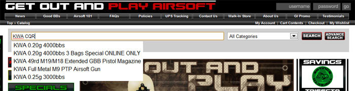
SEARCH FUNCTIONS
Whilst the search area below the header is already enlarged, the search function that will be featured at the upcoming website is already in the present one, which I assume is for testing purposes and tweaked further before it gets launched.
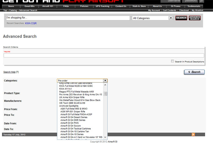
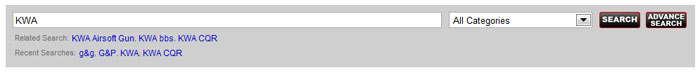
Now on to the search function. You will be familiar with the search function as it is similar to searching with Google Search. Type in the initial letters and the form drops down showing the 5 top search items relevant to the keyword. However, typing "KWA CQR" does not immediately show the top 5 search items of the "KWA CQR" keyphrase but rather show the first 5 items of the Database with the KWA keyword, only when I press the search button does the relevant information I needed show up in the search results page. The drop down "categories" menu in the search form contain the same items as of the existing website.
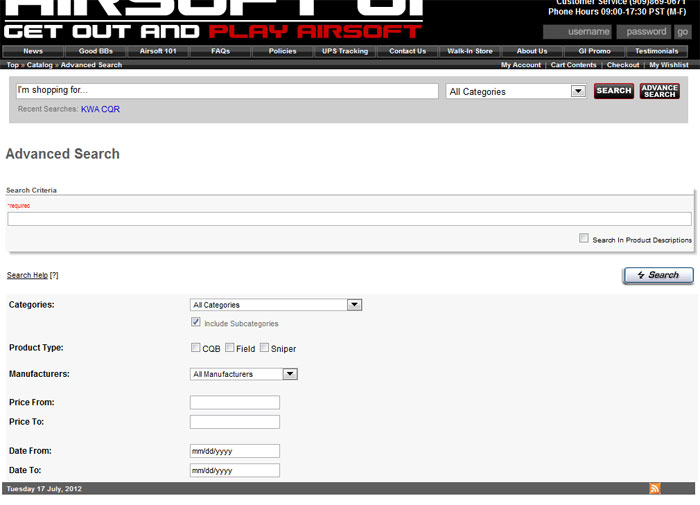
The Advanced Search function looks very much refined and the categories drop down can include sub-sections. A test search with more defined parameters came out with results, especially with the price range and manufacturer parameters. There is a field to define date parameters, but I am not sure if customers would use that search field since what they usually have in mind is product brand and model rather than dates on which the products are posted. But, it's a thoughtful function they have included.
The search results page also provides a better viewing option of the search results, filter the results further according to price and sorting them alphabetically, by price, by rating, or by reviews. I like the viewing option as either I can view the products in detailed view or thumbnails. If you want a more compact search results so you don't have to scroll down further, go for the thumbnails.
One nice feature of the search form is the inclusion of "recent searches" and "related search" which will use the cookies stored by the website to remember you search history. It helps to know this and you can just click on the links rather than keying-in again the search keyword or key phrase.
PRODUCT VIEW
The Product Page, where you view the product you're interested in, is one of the best features of the Airsoft GI website as it's very comprehensive, well-written, and with more supporting images. Airsoft GI's is one of the few online airsoft retailers that take pains to present their product properly. Viewing a product image still remains the same, with a very clear price of the product shown immediately. I have visited a lot of airsoft retailer websites, and a good portion of such online stores is that pricing cannot be found immediately. A bigger font for the product price is always a good thing for a shopper as that's the initial factor in making in purchase decision.
The Product Page has oversized icons, which is well a good, especially for the "Add To Cart" which allows no mistake in clicking for the customer.
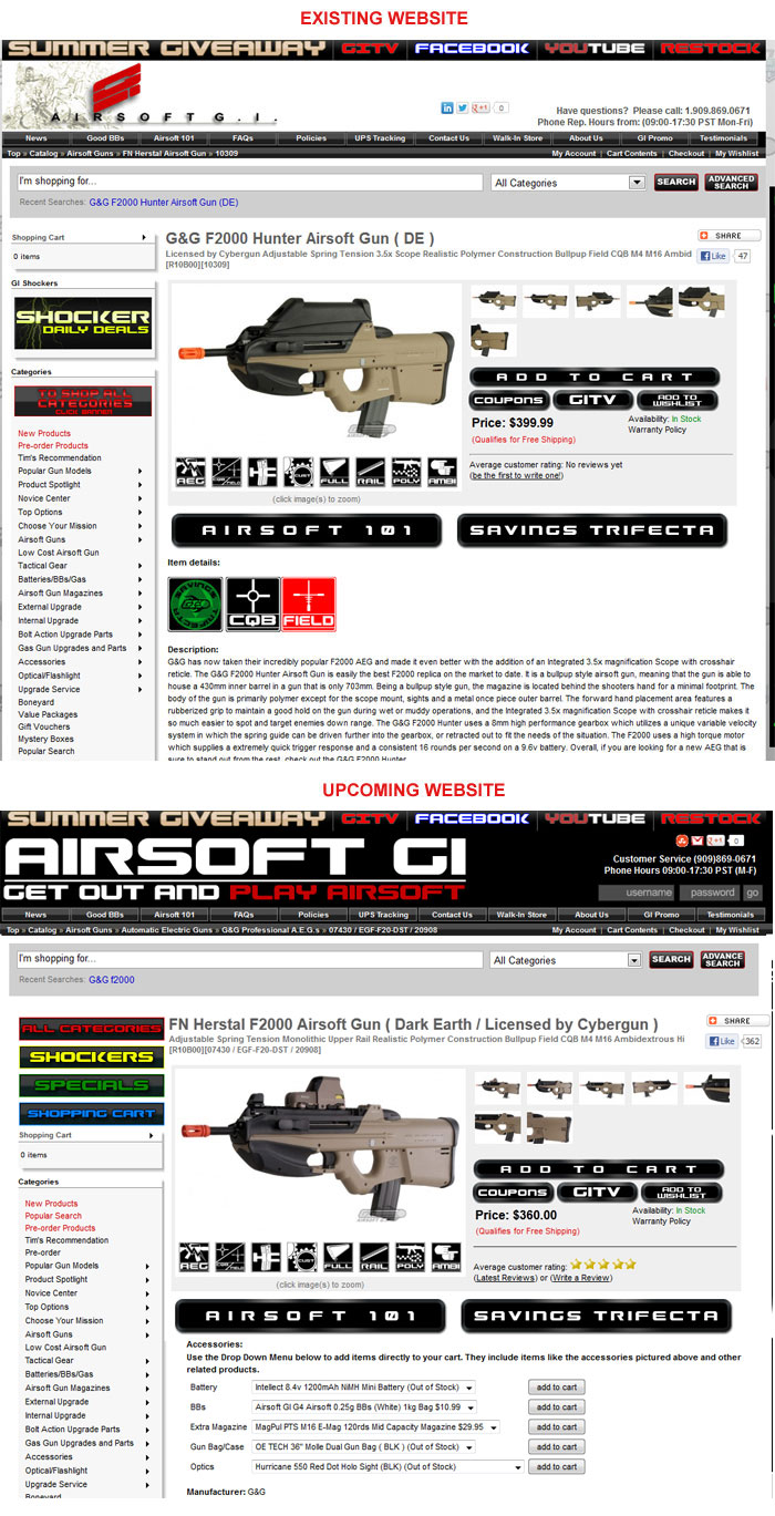
In this case, I am ambivalent about the GITV icon at the product overview box which since it leads to the Airsoft GI TV blog and does not exactly relate to helping the customer get buying benefits since the two icons beside it ("Coupons" and "Add To Wishlist") are about online shopping and I would rather have the GITV icon moved beside "Airsoft 101" and "Savings Trifecta" replace the GITV icon instead as it's more relevant in the icon group in the product overview box.
The "Accessories" drop down menus is a good feature for both the customer as he/she gets to select what can come along with that purchase rather than doing a product search again to find something to match the it, in this case the FN Herstal F2000 AEG by G&G. This is a shopping convenience feature especially for someone who doesn't like to waste time and for Airsoft GI, a good chance to make an upsell in a quick manner.
A video of the product is very helpful and it's one of the better selling approaches nowadays when people tend to be more media obsessed when assessing a product. If a video is available for a certain product, then I would suggest that Airsoft GI follow the YouTube style of having the video on top of the product text description. Video is better at doing sales nowadays, and if the user wants to view the specifications and further information, just a little bit more of scrolling down won't hurt and it's a good sign since the possibility of making a purchase is now much higher.
If you notice the "Add This" share icon on the upper left of the product page, I'm sure you're already familiar with it as you can share the page via email or social networks so that your friends or contacts are alerted about the product and more so, if they are actually searching for that product. This is a good feature, but to make it even better is to include the social media "share icons" (Facebook "Like", Google Plus "+1", Twitter "Tweet", or Pinterest "Pin It") in the product overview box below the "Coupon" and "Wishlist" Icons. This way, customers can immediately share the page to whatever social network they are active in. The "Add This" share icon is also small and not immediately noticeable to be really effective.
Nowadays, "Social media icons on shopping sites influence purchase decisions" and well-placed social media icons would influence purchasing decisions even better.
CONCLUSION
Save for some design "flaws" I have pointed out and can be easily remedied for better navigation and recommendation tools, Airsoft GI's upcoming website is more a "refinement" rather than a total overhaul of the website. I could have recommended a more whizbang website with all the web design trends included, but an online store is more about finding a product quickly in relevant manner. Pages should load quickly, which they do; searching for products done more quickly and have filters to make product search more precise which is also quite good with the improved design.
I have not delved into the SEO aspects of the website, since that portion is always a moving target and I'm not really such a big fan of SEO. A website is still best if it's promoted the old way, via word of mouth, albeit assisted with the new social media/networking tools to make it "hyper word of mouth". Even Google will look more into the "organic" way on how the website's content is done (such as freshness) and how valid websites link to it.
I cannot fault Airsoft GI for their product presentation at their website, which they are really good at and should always remain to be that way (or even make it even better). They just need to enlarge the fonts, navigational buttons, and social media sharing icons to make them even more readable given that more and more internet users are going small screen with tablet computers and mobile phones.
My guess why Airsoft GI are not doing a radical design change is not to affect their existing customers' visiting habits, as they're already familiar with the navigational features and section placements of the website. The design is rather a gradual thing, adding a feature here, a feature there, and in a non-upsetting way. They're online to sell and what is important is that their website be able to serve the product page quickly through the search functions and present the product in an organised way with options on how the customer can benefit from buying from them with their rewards, savings offers, free shipping deals, and the ability to share the information to other potential customers. In this case, Airsoft GI, with some minor adjustments as based on my recommendation, can sell even more, provided that they always have the product(s) in stock.
Perhaps you, as a loyal Airsoft GI customer, have something in mind to improve your online shopping experience with them. You better use their "Contact Us" page immediately before they deploy their improved website. Your feedback is always valuable for any serious airsoft retailer.